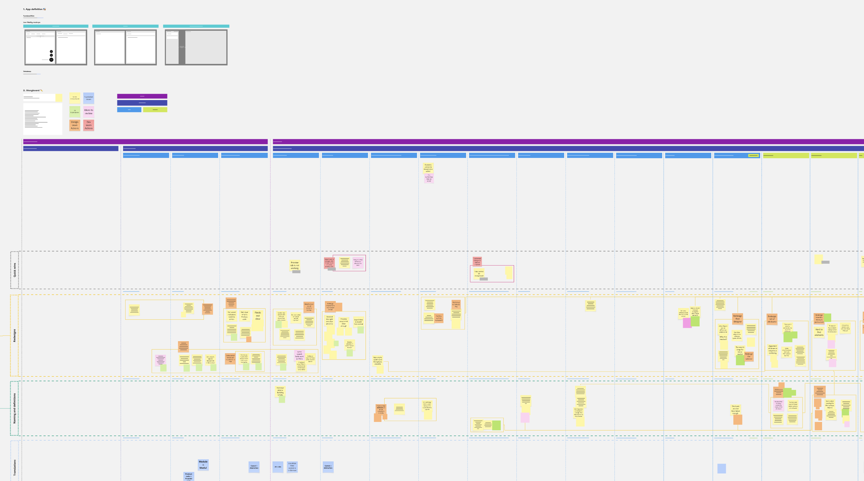
Logo of nietoArranz
Enrique Nieto Arranz
//
designer
Enterprise Application Builder
Company
Build.one
Role
Design Lead and Product manager
Summary
Redesign of key functionalities in an enterprise application builder platform, focusing on improving the user experience and modernising the look and feel.
Screenshot of the Enterprise Builder Application
brief
Challenges
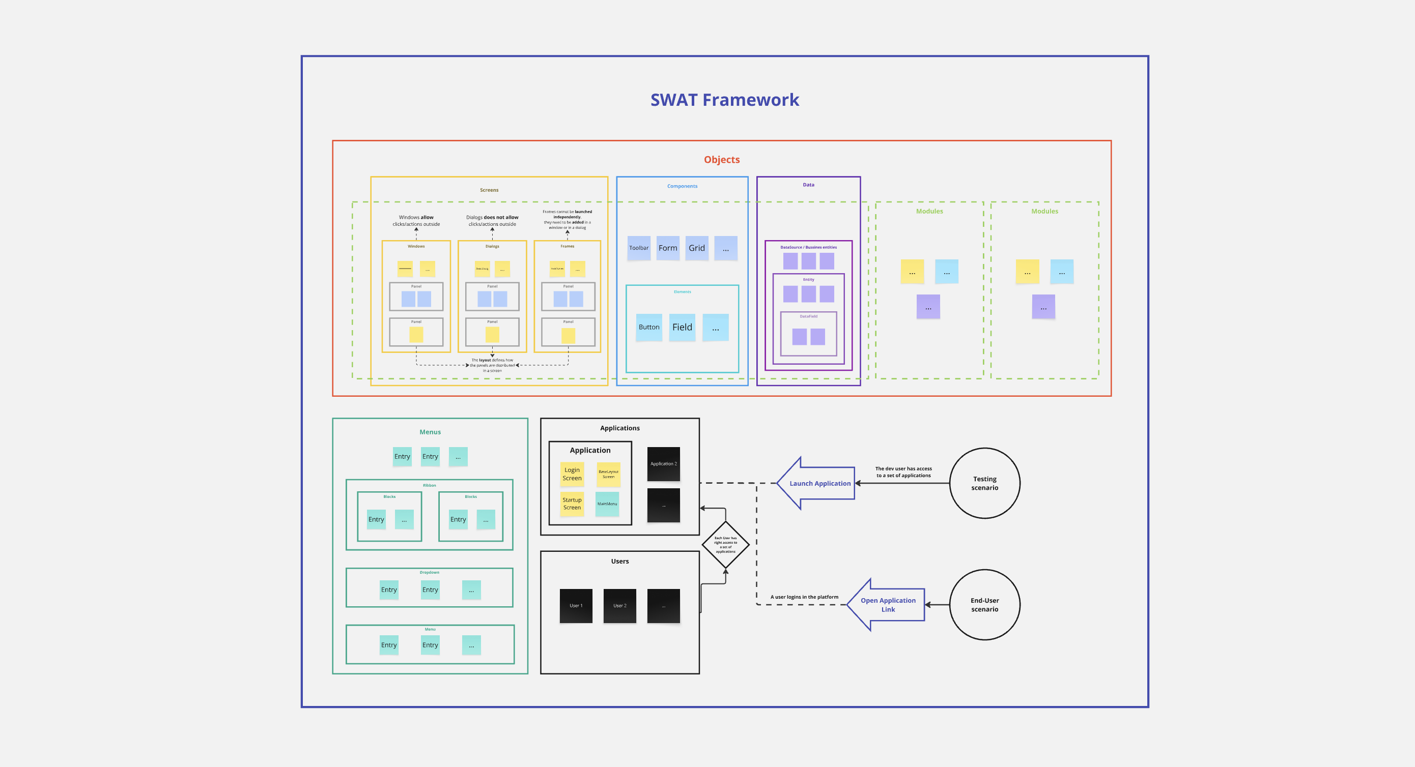
An enterprise application builder is a complex platform with a vast set of features covering the entire development process. Redesigning the user experience required a deep understanding of the underlying technology and its capabilities. Any UX changes had to be made carefully, as the platform already had active users with established workflows that couldn’t be disrupted.
Solutions
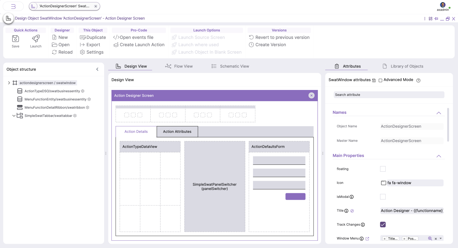
We focused on identifying the most critical areas of the workflow and prioritised redesigning those. This included the platform’s various visual designers used to create UI components, menu structures, and logic flows. Additionally the whole UI Design was modernized. The redesign introduced useful new functionalities and improved the UX, while intentionally preserving the general structure to avoid disrupting users. We were also mindful of the technological constraints, aiming not to redefine the underlying system but to clarify and better communicate its existing capabilities.
process
To tackle the redesign, we followed a focused process that balanced user needs, technical realities, and design goals
  1. Understanding user workflows.

    Analysed how real users interacted with the platform to identify pain points and opportunities.
  2. Understanding the technology.

    Mapped out technical constraints and possibilities to ensure feasible design decisions.
  3. Definition of requirements.

    Worked with stakeholders to align on goals, priorities, and scope for the redesign.
  4. Initial UX designs.

    Created wireframes and prototypes to explore improved flows and interfaces.
  5. Validation of designs.

    Collected feedback through reviews and user testing to refine the solutions.
  6. Collaboration with the development team.

    Partnered closely with developers to ensure smooth implementation of the new designs and provide any modifications when needed.
User Story Map
A board with a User Story Map
Understanding of the Technology
A Board to cover the technology tnderstanding
outcome
Object Designer
(Hover the images to see the old design)
The Object Designer is the main tool to adjust all the elements on a screen, offering a wide range of options (Attributes). The following changes were implemented.
  1. The functionalities were distributed across different views that group related settings.
  2. The options of each object (Attributes) were presented in more comprenhensive way
  3. The area for adding new objects was redesigned with a more visual and intuitive layout.
  4. All additional options were better organized within the ribbons and secondary menus.
New attributes presentation
New area to add new objects
Menu and Actions Designer
(Hover the images to see the old design)
Menus define the button structures in any format (Toolbars, Sidebars, Floating Action Buttons, etc  and can be easily reused across formats. Actions represent the logic executed when a button is clicked. These two areas are key elements in designing the logic workflows of any application built on the platform. The following improvements were introduced:
  1. The general layout of the Menu Designer was restructured to align with the Object Designer, ensuring a more cohesive and consistent experience across the platform.
  2. The Action Designer was simplified to minimise the number of visible options at any time, making the configuration process easier.
  3. The Menu Designer now includes a set of previews, allowing users to easily review all available format types.
New UI Design
(Hover the images to see the old design)
A complex platform like this requires displaying large amounts of information and data simultaneously, creating a major challenge in managing the information hierarchy at any given moment. Adjustments to typography, spacing, and the use of color shades were crucial to provide a clear yet comprehensive presentation of information on every screen.
Additionally, since the entire platform was built using the platform itself, all elements needed to be customisable. This significantly elevated the challenge of delivering a robust UI capable of adapting to the diverse use cases it supports.
Fact Checking Toolbox